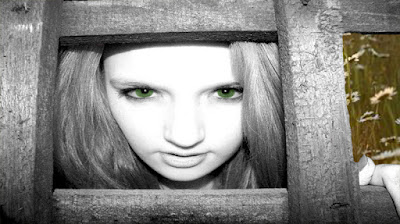
Here are a few edited images which I took last night. I am going to test a variety of ways which I could use for my ancillary texts.
I decided to fiddle about with the effects on Photoshop and changed the eye colour to give the image more colour. I like the contrast between black and white and a bit of colour.
Here I decided to add a background with some colour. As my video is quite summery. I thought I should add a summery theme to my cover. I like this idea because it make my image look more interesting and less boring.
(Edit with text)
Even though I like these images, I don't think that they represent my music video as well as I had hoped. My music video is bright and summery with a hint of black and white contrast, and I don't believe that these images represent this. Therefore I have decided to try something else.
Thursday, 9 February 2012
Tuesday, 7 February 2012
Weather
At the moment, I am a bit unsure of what I will be doing about re-filming my video. As the weather is snowy it will be hard to film on the beach again and I am still figuring out how to get around this problem.
Friday, 3 February 2012
Examples of advertisements
Here are a few examples of posters and advertisements for albums, which I have been looking at to get ideas for my own.
The poster for Kimbra's new album is quite simple and outstanding. It is a simple image of her black and white with what looks like tattoo style drawings on her arms and chest. I like the way it uses no colour but still look's very professional and catches you're eye easily. Plain and simple but still getting the message across.
However, the poster for The Black Key's is the total opposite. The posters image is not a photograph but a artistic painting of the two singers . This stands out more with it's vibrant colours and artistic style rather than it's simplicity and suttleness.
advertisement ideas
I have come up with a few advertisement ideas which I could use for my magazine poster.
The majority of posters for albums include the image which is used on the front of the album or a photograph which is included in the digipak somewhere (such as the booklet or back cover).
Therefore I shall take a few images for my digipak which I can then include on my advertisement as well.
The majority of posters for albums include the image which is used on the front of the album or a photograph which is included in the digipak somewhere (such as the booklet or back cover).
Therefore I shall take a few images for my digipak which I can then include on my advertisement as well.
Update
At the moment, I am trying to find time to re-shoot my video. I am hoping to reshoot next weekend if possible. I am also planning on shooting some scenes over half term whilst I am in Scotland incase any opportunities come up which may help me shoot my video.
On Wednesday 8th February I will be going to take some images for my digipak and poster advertisement.
On Wednesday 8th February I will be going to take some images for my digipak and poster advertisement.
Wednesday, 1 February 2012
Image ideas for digipak
For my digipack, I will be using a couple of my own images which I have taken on recent trips to Blackpool Beach. I will be using them for the front and the back of my digipack. I've decided to use these as it would continue with the beach theme used in my music video.
Original image take by me.
How I changed the colour.
I then changed the colour balance to give it a slight pink/brown tint.
Here is a first sample of an idea for my digipak. I decided to fiddle around with some of the techniques and editing facilities to test how I could design my digipak.
Here is another edit of a possible digipak cover. I have only changed the text a little however below shows how I did this. There are some effects on Photoshop which allows you to change the texts colour. Here I decided to use the 'Sun Faded Photo' image effect. 

Another Test...
This one I am not so keen on as to me it doesn't look very professional for a digipack. Therefore I shall not be using this design.
Subscribe to:
Comments (Atom)


